
When I first started using Photoshop for this assignment, I honestly did not realize how much went into creating something as simple as a postcard. I thought the hardest part would be figuring out what I wanted everything to look like, but I quickly learned that actually putting everything together was a completely different process. Between learning how to use the tools, adjusting pictures and trying to make everything look right, there were definitely moments when I got frustrated. However, after finishing both of my OU Admissions mailers, I feel like I learned a lot about Photoshop and how important design is in public relations.
One University, Two Different Audiences
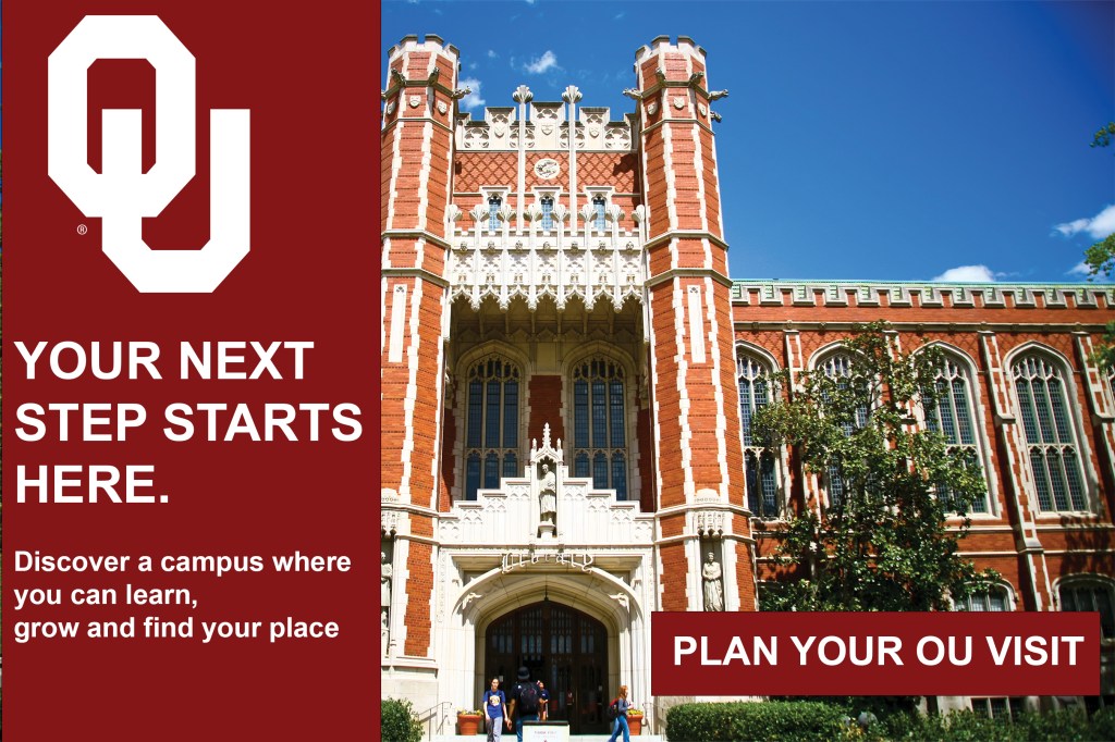
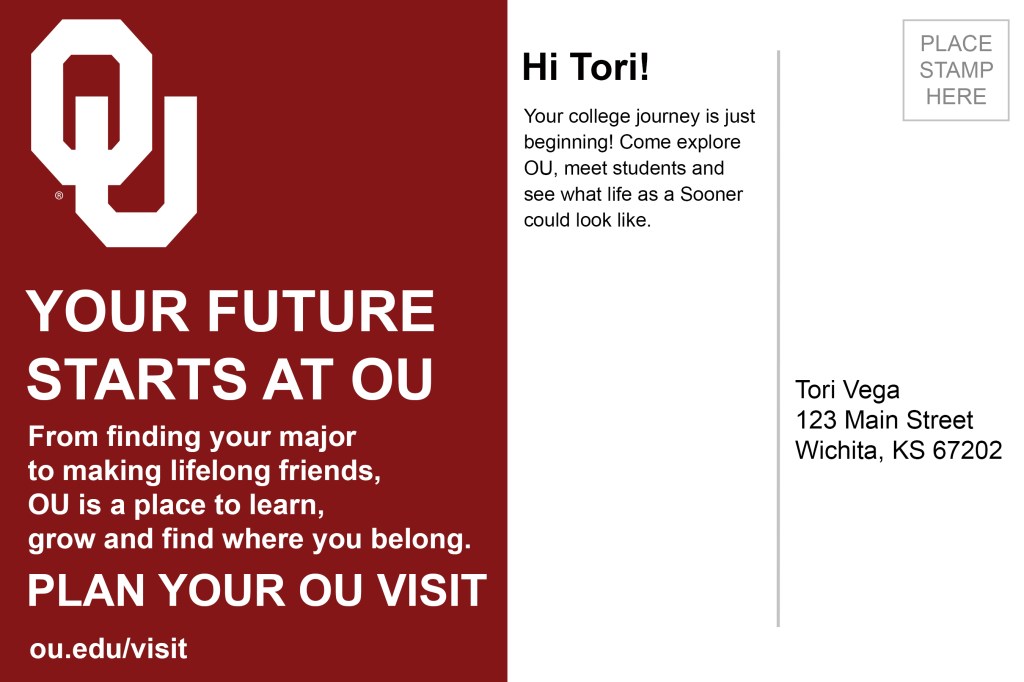
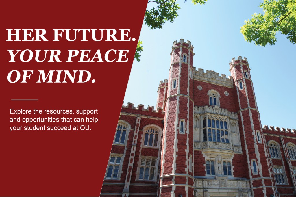
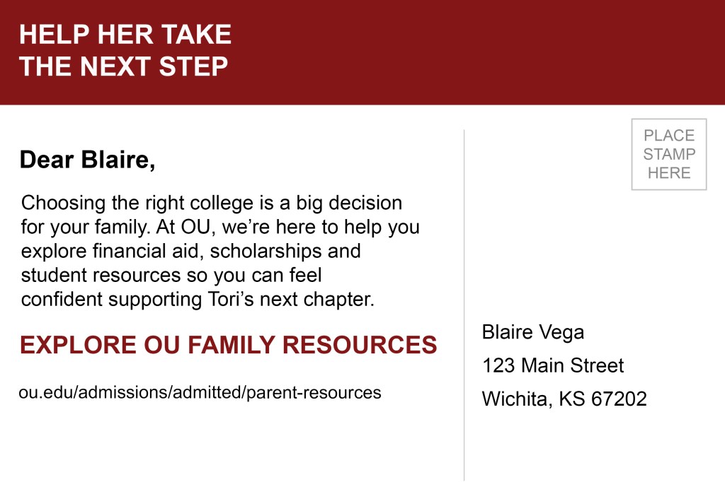
One of the biggest things I took away from this project was how important it is to understand who you’re designing for. For my first stakeholder, I created a mailer for Tori, a prospective OU student who would be the first in her family to attend a four-year university. My second stakeholder was her mom, Blaire, who was helping her through the college decision process.
Even though they were both looking at the same university, they had different concerns and priorities. Tori was more focused on finding a place where she could make friends, get involved and feel comfortable. Blaire was more concerned about financial aid, scholarships and making sure her daughter would have the resources she needed.
Creating Tori’s mailer first actually helped me figure out what I wanted to do for Blaire’s. I realized that I couldn’t just change a few words and use the exact same design. I needed to think about what would catch each person’s attention and what information would matter most to them.
Why the Little Details Matter
Something I learned pretty quickly is that your first design is probably not going to be your final design. When I first finished my mailers, I thought they looked good, but after getting feedback from my professor, I realized there were several things I could improve.
One of the main things I needed to work on was spacing. Some of my text was too close to the edges, and certain parts of my designs felt a little crowded. I also had to adjust the placement of one of my campus pictures so the building looked more centered and balanced.
At first, I didn’t think moving something over a little or adding more space would make that big of a difference, but it actually did. Looking at my original designs compared to my final ones, I can definitely see how those small changes made everything look cleaner and easier to read.
This taught me that sometimes you don’t need to completely redo a design to make it better. You just need to pay attention to the details and be willing to make changes.
What I Wish I Knew Before Using Photoshop
If I could give someone advice before they started using Photoshop, I would definitely tell them to be patient. There were times when I would try to move or resize one thing, and something completely different would happen. It took me a little while to get comfortable with how everything worked.
One of the most helpful things I learned was how important layers are. Being able to select one specific picture, shape or text box without changing everything else made the process so much easier. I also found myself using the Move tool and Free Transform a lot when trying to get everything positioned correctly.
Another tip I would give is to zoom out and look at the entire design instead of focusing on one little section for too long. Sometimes I thought something looked perfectly fine up close, but when I zoomed out, I realized it wasn’t as balanced as I thought.
I also think it’s important to not be afraid to try different things. There were several times when I moved something around, didn’t like it and changed it back. But I think that’s part of learning how to use the software and figuring out what looks best.
What I learned From This Project
Overall, I think this assignment helped me understand that Photoshop is more than just a program for editing pictures or creating graphics. It really makes you think about how everything works together to communicate a message.
Before this project, I probably would have focused more on whether a design looked visually appealing. Now, I pay more attention to things like spacing, where someone’s eyes will go first and whether the information actually makes sense for the audience.
I also realized how much feedback can improve your work. Even when you think something is finished, having someone else look at it can help you notice things you completely missed.
As a public relations student, I know these are skills I will continue to use, especially when creating content for different audiences. I still have a lot to learn about Photoshop, but I feel much more comfortable using it now than I did at the beginning of this assignment.
The biggest thing I learned is that a good design isn’t just about making something look nice. It’s about making sure the message is clear, the audience is considered and every design choice has a purpose.


Leave a Reply