As public relations professionals we often spend a lot of time writing the press release. We focus on crafting the message, pitching journalists, and building communication plans. But words alone don’t always get the job done. A message can be strong in text. If it doesn’t stand out visually it might not be seen at all.
That’s where design comes in. Design is not just about looking nice—it’s a tool in strategic communication. Good design grabs attention. It guides the eye to what matters. It helps shape how people see a brand. It makes sure the main message isn’t lost in translation.
To test this idea I decided to take a walk through the city—what I call a Design Blitz. I looked for real-world examples of design principles in action. I paid attention to signs, billboards, posters, storefronts and everyday things, like packaging or street furniture. My goal was simple: find design, spot bad design and learn from both.
What follows is a breakdown of design concepts used in public relations. Each one is paired with examples I saw during my walk. For each case I’ll share what worked well what didn’t. How PR teams can use these lessons effectively in their own work.
The Strategic PR Design Toolkit
Before I share my field findings I will first set the terms that we use in our work. By basing our choices on clear design definitions we make sure that our plans always come through on the page or screen.
- Color: Color is a visual element that adds depth builds hierarchy and triggers strong feelings. Color shows warmth or coolness and shapes brand identity across cultures.
- Typography: Typography is the art of arranging type. It involves choosing fonts setting size adjusting line spacing, overall spacing and letter spacing so that written words become clear, welcoming and match the feelings of the message.
- Metaphors & Symbols: Metaphors and Symbols are shortcuts like logos or icons. They express ideas quickly and universally without language or cultural limits.
- Space: Minimalism and Space mean using space deliberately around a single focus point. It lets the viewer’s eye rest. Stops visual clutter.
- Form, Function & Message: Form, Function and Message are aligned strategically. Form is how something looks. Function is its purpose such as informing or persuading and Message is the takeaway. Together they work in harmony.
- Balance: Balance equalizes weight across vertical or horizontal lines. It can be symmetrical which feels formal and centered or asymmetrical which feels dynamic and energetic using two–thirds to one– divisions or the Rule of Thirds.
- Rhythm (Movement): Rhythm or Movement is the repeat of elements like lines, shapes or type. It creates patterns. Guides the eye in a sequence often in a classic Z-pattern through a design.
- Proportion: Proportion is the relationship of size and space between parts, in a layout. It tells how elements relate to each other to create harmony.
- Dominance (Emphasis): Dominance or Emphasis makes a focal point—a visual bullseye—that draws attention first. It uses size, color intensity or placement to stand out before other parts are seen.
- Unity: Unity is the harmony where similarity, continuity, alignment and proximity bring all design parts together. It lets the viewer see a whole before noticing individual pieces.
Field Notes: The Design Blitz Findings
1. Apple Packaging: Minimalism & Space
- Concept: Minimalism & Space
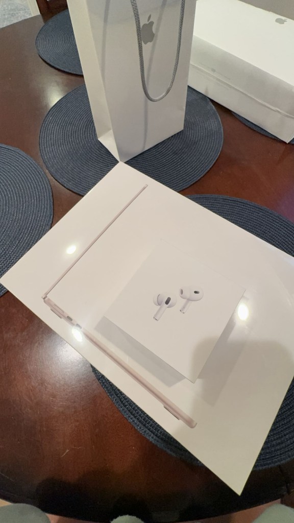
- What I Found: I captured Apple’s iconic packaging, specifically an Apple Store bag alongside iPad and AirPods boxes. The design deliberately utilizes vast amounts of clean white negative space, leaving only tiny, isolated focal points: the simple Apple logo and a small image of the earbuds.
- Strategic PR Impact: In strategic PR design, negative space is never “wasted” space, it is visual breathing room that communicates elegance, premium quality, and effortless status. By stripping away visual clutter, Apple forces the viewer’s eye directly onto the logo and product image. This minimalist approach elevates the brand’s identity and creates high visual recall before the customer even opens the box.
2. Chi Omega Banner: Typography
- Concept: Typography
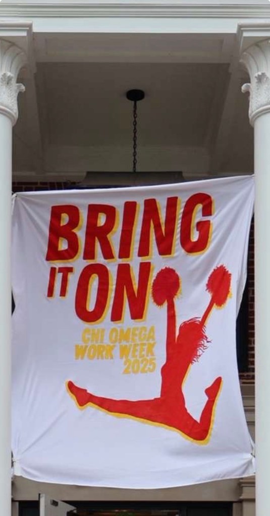
- What I Found: I got a photo of a banner outside a sorority house reading “BRING IT ON” for Chi Omega Work Week. The design utilizes a heavy, all-caps, sans-serif block font in bold red with yellow drop-shadows/outlines. The main headline “BRING IT ON” is significantly larger than the event details below (“CHI OMEGA WORK WEEK 2025”), establishing a clear typographical hierarchy.
- Strategic PR Impact: Typography sets the mood long before a reader digests the text. Here, the thick, forward-leaning block lettering mimics athletic gear and energetic sports signage, perfectly matching the high-energy theme of the event. However, from a PR design standpoint, the light yellow outline around the red letters creates a low-contrast edge against the white background. While the large size keeps “BRING IT ON” legible, the smaller yellow body copy underneath becomes slightly harder to read at a distance—a classic trade-off where style slightly compromises readability.
3.Fridge Cans: Rhythm (Movement) & Repetition
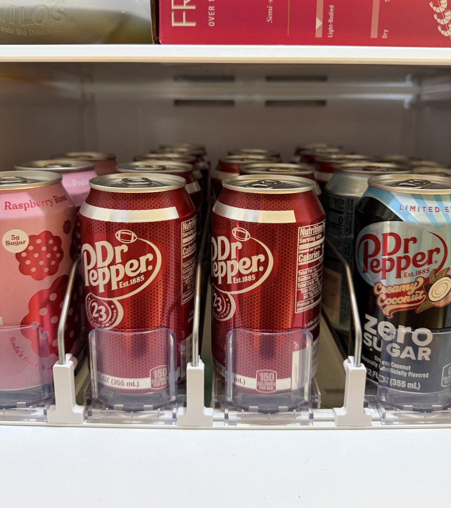
- Concept: Rhythm (Movement) & Repetition
- What I Found: Inside my fridge, I captured rows of soda cans neatly organized in a dispenser track. The repeating cylindrical shapes, identical logos, and parallel vertical lines create a strong visual pattern that draws the eye continuously from front to back across the shelf.
- Strategic PR Impact: Rhythm relies on the deliberate repetition of design elements—such as lines, shapes, or typography—to guide the audience’s eye along a planned visual movement. In strategic PR design, repetition creates structured consistency. Whether designing a multipage annual report, a social media campaign template, or branded product packaging, establishing visual rhythm keeps layouts organized and cohesive, preventing cognitive fatigue and making complex information easier to digest.
4. Pink Package: Color & Dominance
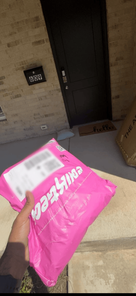
- Concept: Color & Dominance (Emphasis)
- What I Found: While retrieving a package at my doorstep, I captured this hot pink Edikted mailer sitting against the neutral tan bricks and concrete floor of an apartment entryway. The intense, highly saturated pink immediately jumps out against the muted surroundings, creating an undeniable visual focal point.
- Strategic PR Impact: Color choice is one of the most powerful tools for brand recognition and visual hierarchy. Hot pink possesses high saturation and warmth, causing it to “pop” forward in space while neutral backgrounds recede. From a PR perspective, this turns an ordinary shipping package into a walking billboard, it demands immediate attention, creates excitement upon delivery, and ensures the brand stands out in any environment. Additionally, the extreme visual contrast establishes clear Dominance, guaranteeing the package is the first and only thing your eyes focus on in the frame.
Last Thoughts on Strategic Communicators
Spotting these elements during a Design Blitz reinforces a lesson: great PR design is never accidental. Whether choosing a typeface for a report balancing an asymmetrical layout, for a press kit, or leveraging negative space on a landing page, our visual choices directly impact how our message is received, remembered, and acted upon.
What design wins or fails have you noticed in your commute?
References & Strategic Reading
- For a deep dive into structuring digital content effectively, check out MailChimp’s comprehensive guide on How to Write a Blog Post: 6 Steps + Tips
- Revisit layout foundations and grid alignment techniques via “Graphic Design Foundations: Layout and Composition,”
 Keeley Iserman | Behind the message PR
Leave a comment