
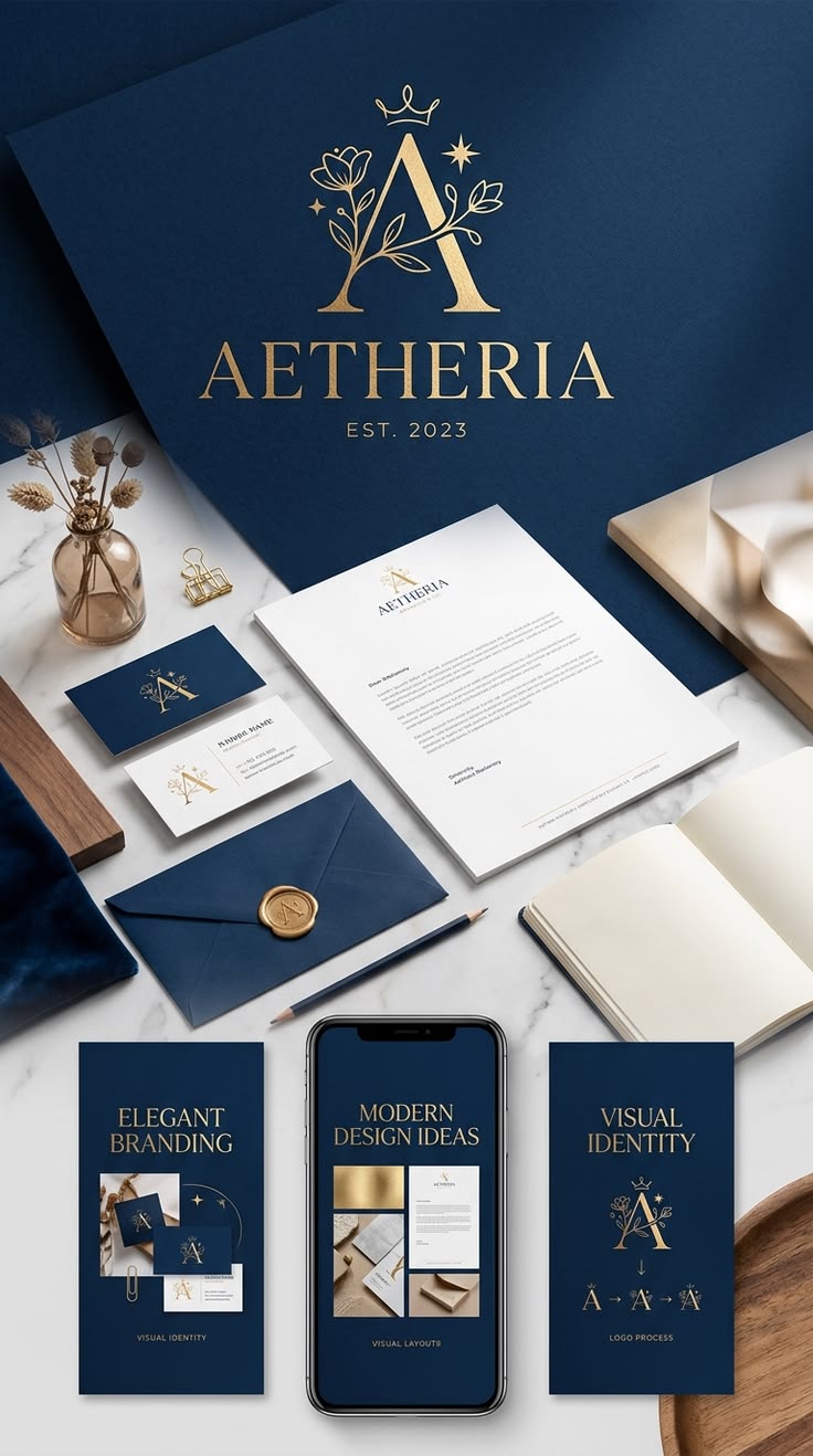
Turning My Brand Into a Visual Language
As I begin designing collateral materials for my personal brand, I want every choice to communicate something about who I am before someone even reads all of the information. My research and Pinterest boards helped me realize that a strong personal brand is not just about choosing colors or fonts that look good together. Each element should support the message I want to communicate.
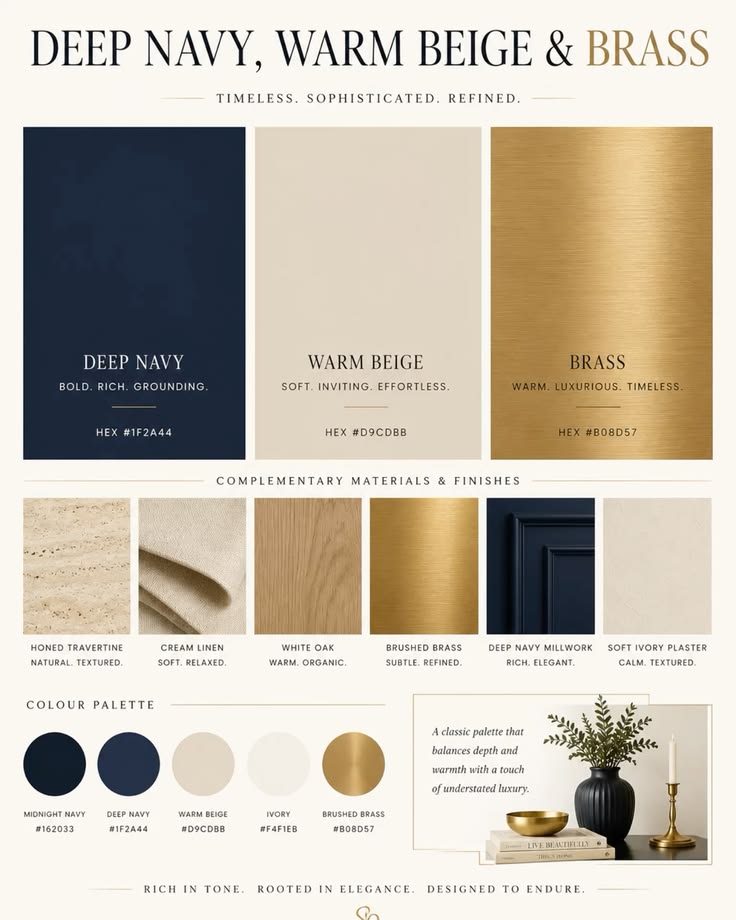
For my brand, I want to communicate confidence, professionalism, dependability and leadership while still appearing approachable. My visual language will use deep navy, cream and gold or brass accents. Navy creates the professional and confident foundation I want, while cream keeps the design clean and approachable. Gold will be used more sparingly as an accent to add a polished and sophisticated feeling. Together, these elements support my personal brand statement, “Communicate with Confidence. Lead with Purpose.”
Choosing Type and Images With Purpose
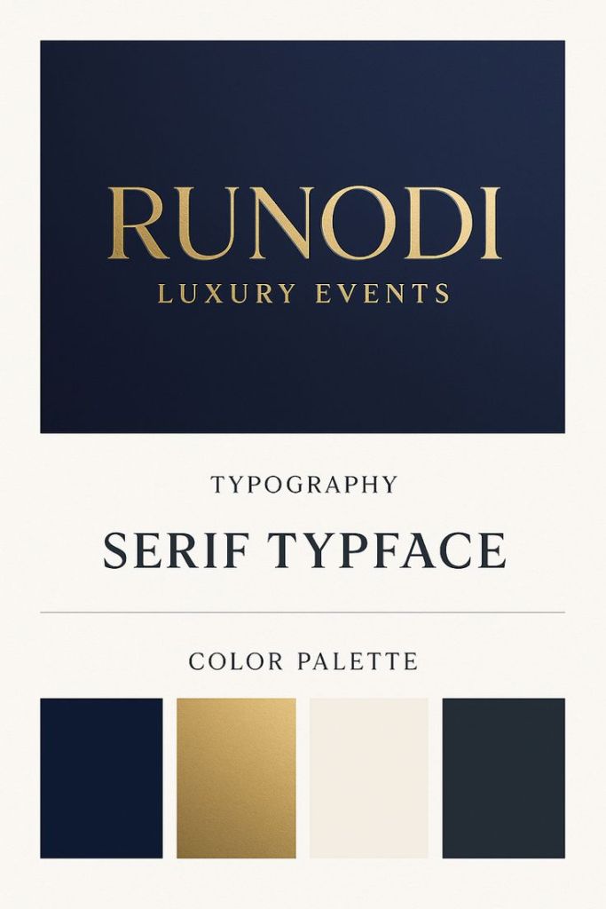
I want my collateral materials to be more type-driven than image-driven. For something like my business card, I do not think I need several photographs or decorative elements to communicate my identity. Instead, I want typography, color, spacing and possibly a simple monogram to create the visual impact.
My Pinterest research especially inspired me to explore elegant serif typefaces paired with a cleaner, simpler font. I could use the serif typeface for my name or initials and a more readable typeface for information such as my email, phone number and website. I want the typography to feel confident and sophisticated without becoming overly formal or difficult to read. The overall design should remain simple enough that the important information is immediately clear.
What I Want My Business Card to Say
When someone receives my business card, I want the design to communicate that I am confident, prepared and professional. At the same time, I do not want it to feel cold or overly corporate. The cream tones, thoughtful spacing and limited use of gold can help create a more approachable feeling while maintaining a polished appearance.
Ultimately, my research has shown me that successful design is intentional. The colors, typography and visual elements I choose all carry different meanings and connotations. As I begin creating my business card, I want every element to work together instead of simply adding things because they look attractive. My goal is to create a design that feels like a natural extension of who I am and the professional I am working to become.


Leave a Reply