
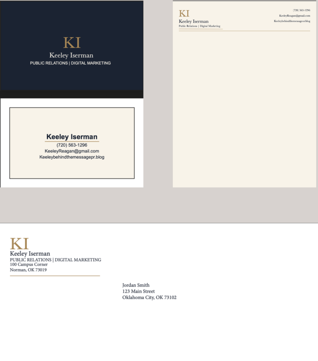
Before starting this project, I thought designing a business card, letterhead and envelope would be pretty simple. I knew I wanted all three pieces to look professional and match my personal brand, but I did not realize how much thought goes into even the smallest design choices. Throughout this project, I learned that things like spacing, alignment, color and font choices can completely change the way a design looks and feels.
For my designs, I wanted something that felt professional and confident but still represented me. I decided to use navy, gold and cream throughout all three pieces, along with my KI logo. By the end of the project, I realized that creating strong collateral materials is not just about making each piece look good on its own. They also have to look like they belong together.
Consistency Makes a Difference
One of the biggest things I learned was how important consistency is. Since my business card, letterhead and envelope are all part of the same personal brand, I wanted someone to be able to look at any of them and immediately recognize that they go together.
I used the same colors, fonts, logo and overall style throughout each design. I also used a thin gold line as a repeated design element. While I was revising my work, I realized that even having the line in a different place on one design made the pieces feel less connected.
This showed me why consistency is so important in public relations. The way an organization presents itself visually can affect how people view it. Keeping the same colors, fonts and design style helps make a brand look more recognizable and professional.


Simple Does Not Mean Boring
Another thing I learned is that you do not have to fill every empty space for a design to look finished. At first, having so much open space made me feel like I needed to add something else. As I continued working on the designs, I realized that the white space was actually helping them.
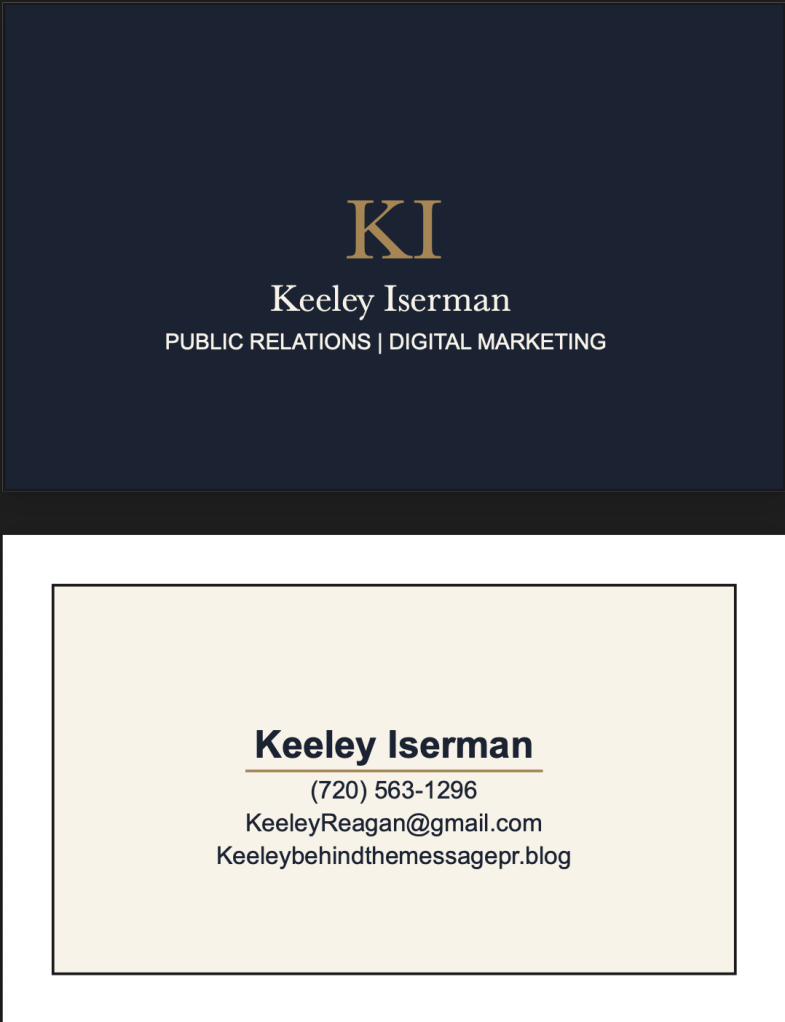
For example, my letterhead needed enough open space to actually write a letter, so adding more design elements would have taken away from its purpose. I also kept my business card simple so that my name and contact information would be easy to find.
Balance and alignment became really important during this process too. Even when something was only slightly off-center, I could tell that the whole design looked different. Using guides in InDesign helped me keep everything organized and made the final designs look much cleaner.
Creating a Design That Feels Like Me
My favorite part of this project was choosing the overall look of my personal brand. I wanted it to feel professional without being boring or overly corporate. I chose navy because it feels professional and dependable, while gold adds a little more personality and confidence. I used cream instead of a bright white because I thought it made everything feel a little softer and more polished.
Typography also made a bigger difference than I expected. I wanted my name to stand out first, with the rest of the information supporting it instead of competing with it. Creating that hierarchy helped make the designs easier to read and gave each piece a more organized look.
This connected a lot to what I learned in my previous post, “The Power Between the Letters: Why Typography Can Make or Break a Design.” Choosing a font is only one part of typography. Size, spacing, placement and hierarchy all affect how someone reads a design.
Feedback Made the Designs Better
Another important part of this project was getting feedback and actually using it. Some of the changes I made seemed really small, like centering text, changing spacing or moving a line. Once I made those changes, though, I could see why they mattered.
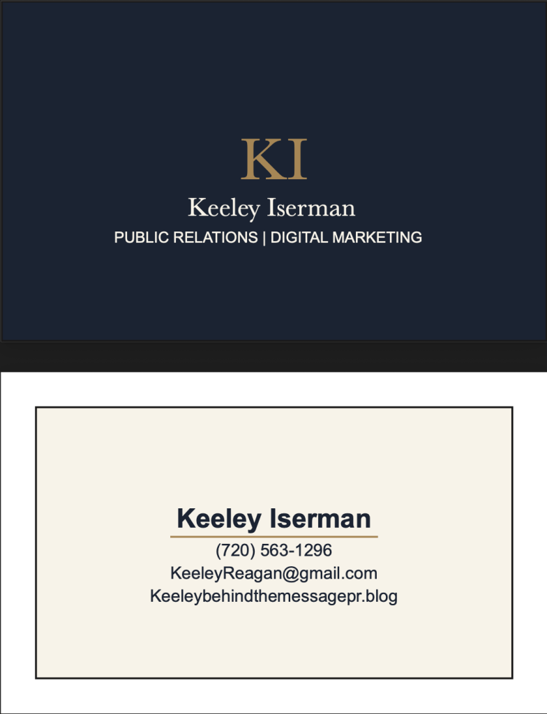
For example, I adjusted the spacing between information on my business card, made sure my envelope included a complete return address and made the design elements more consistent between all three pieces. Those changes helped everything feel more connected.
I think this was one of the most useful parts of the project because it reminded me that your first design does not have to be your final design. Sometimes you get so used to looking at your own work that you stop noticing little things. Having someone else look at it can help you see what could be improved.
What I’ll Take From This Project
The biggest thing I learned from this project is that good design should feel intentional. Something as simple as a business card or envelope can communicate a lot about a person or organization before someone even reads all of the information on it.
As a PR student, I think understanding design is important because public relations is not only about what you say. It is also about how you present the message. Having strong and consistent collateral materials can help create a professional image and make a brand more recognizable.
After creating all three pieces, I understand much more about balance, harmony, white space, hierarchy and consistency. More importantly, I learned how all of those pieces can work together to create a brand that actually feels like me.


Leave a Reply