
More Than Just Picking a Pretty Font
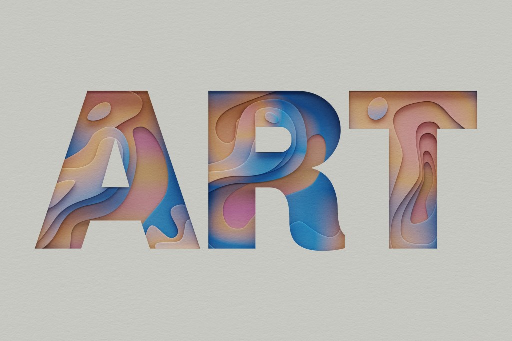
Typography is something we see every day even if we don’t always pay attention to it. It is the way text is arranged and designed to make written information easy to read, visually pleasing, and effective. Typography includes decisions like the typeface, the size of the letters, the space between them, how the text is aligned, and how letters and words relate to each other.
Before I started learning more about typography I mostly thought choosing type was about picking a font that looked nice. I soon learned there is so much more going on behind the scenes. Even the smallest choices can completely change how a design looks, how it feels, and how it connects with an audience.
I Tried Kerning…And It’s Harder Than It Looks
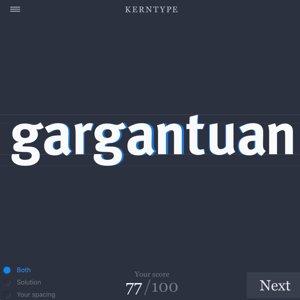
One most important part of typography is kerning, or adjusting the space between individual letters. I practiced this in the Kern Type
game. where my goal was to move the letters around until the spacing looked balanced and readable. After finishing each word the game compared my choices with a typographer’s solution and gave me a score.
At first it seemed such a simple detail to change individual letters around. But once I started playing I realized how fast bad spacing could make a word look odd. If letters are too close together then a word can feel crowded, but if there is too much space then the letters can feel disconnected. The game made me realize that good typography often works because of details the average person might never notice consciously.
Typography Changes the Way We Experience Design
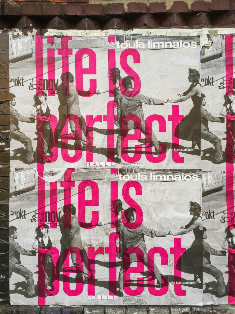
Typography does more than make words readable. It can change how someone feels about a design even before they start reading the words. A big, strong typeface can grab attention, while another typeface might make the same message feel fancy, serious or friendly.
Typography also helps create an order. Differences in size, thickness, position and space show readers what to look at first next and then last. When typography is done right the reader might not even realize why the information is easy to follow. Their eyes just know where to go.
This is why typography plays a role in telling a visual story. A design might have pictures, colors and details but bad typography can make the whole thing hard to read or understand. Good typography can arrange information set a feeling and keep everything looking the same throughout the design.
The Small Details Make Big a Difference
Playing Kern Type made me notice design choices I probably would have missed before. Something basic as the space between two letters can change how an entire word looks.
As I keep working on designs I want to focus not on which typefaces I use but also on spacing, structure, ease of reading and how the typography helps deliver the main message. Typography might seem like a part of a design but I discovered that those tiny decisions can make a big difference, in what people see feel and understand.
Just like other areas of public relations and communication, small choices can influence how an audience receives a message. I have explored the importance of communication choices in my previous post, PR Wins and Disasters: What Separates Success From Failure?
 Keeley Iserman | Behind the message PR
Leave a comment